Task 4: Replication - Re-create and Improve a Chart
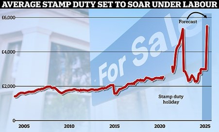
A Daily Mail chart.
My recreation of the Daily Mail chart.
Improved chart: I removed the background image and on-chart text, thinned the line and removed its shadow (to increase data-ink ratio) and made the subtitle more informative.